
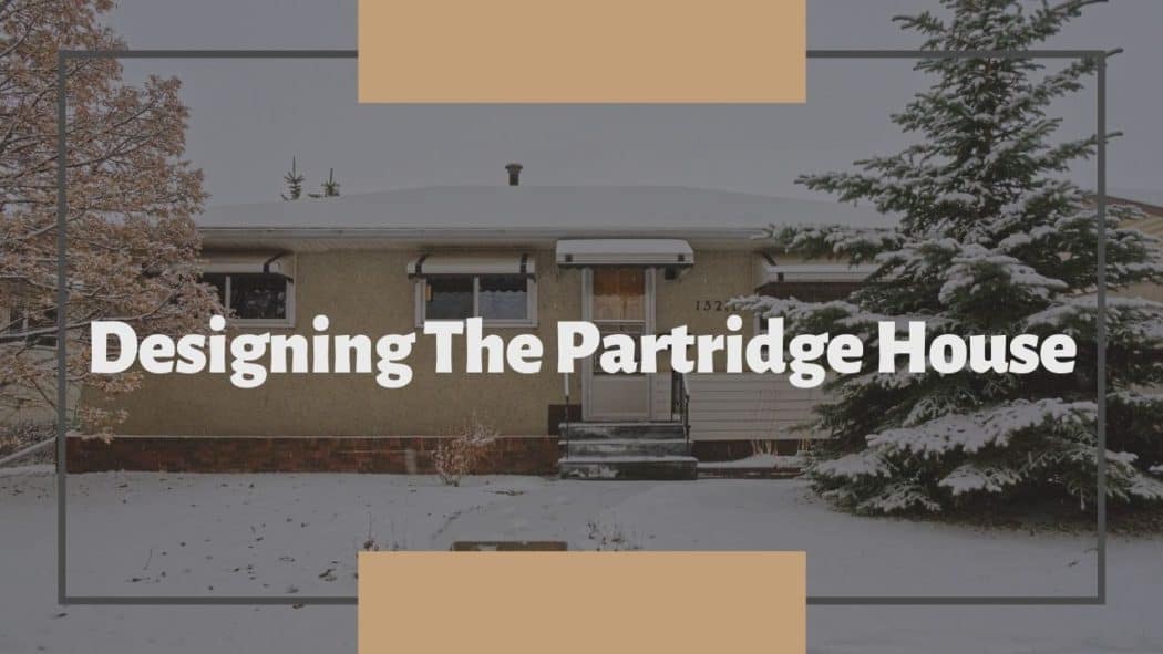
Well the time has finally come, it’s demo day!
We recently purchased our third house here at The Homestud. A place we are calling The Partridge House.
In case you missed it, check out the house tour to get caught up.
Demo week was relatively straight forward at this house. There were no major wall removals, just a few interior walls in the laundry room. The carpets came out fairly easily (outside of the million staples and tack strips), and even the wallpaper came off without too much effort. The only real pain was removing the built-in-place kitchen cabinets from the 1950’s. That saying you hear, “They don’t build things like they used to” definitely rings true in this case.
I know lots of people have a grandiose vision of demo days including a large sledge hammer and bashing everything in sight. Well I hate to burst your bubble, but I spent far more time with a small pry bar and an exacto knife. I didn’t even take the sledge hammer out of the work trailer.
As you can see, it is far easier to keep the work site clean, organized, and safe when you hold in the reigns during demo.
Anyways, enough about demo. Let’s get onto the real point of this post- the design for The Partridge House.
The Partridge House design
I’m not exactly sure how to categorize the overall design for this house. It’s a bit of a mashup between modern, mid-century, Scandinavian, and industrial, finished with a touch or traditional elements.
The other difference between this house and some of our others is that we are planning to stage this property once it is complete. This will allow us to discuss the design on a room by room basis, as well as reveal the home one room at a time.
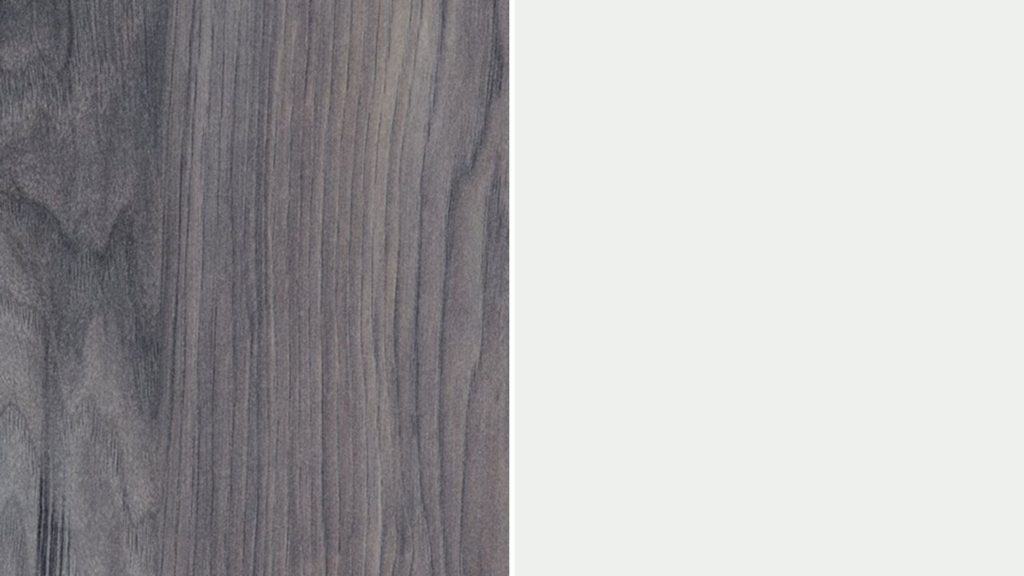
There are a few design choices that will carried throughout the entire main floor. The first is the sterling hickory laminate flooring. Originally I was dead set on selecting a blonde maple color, but after seeing a sample in the space, it just wasn’t going to work. It clashed with the mahogany wood we are refinishing, and looked completely washed out with the Frost white paint. We ended up choosing a laminate that is medium grey without a drastic wood grain. I didn’t want much wood grain in the floor because it can start resembling a farmhouse look. and the touch of grain it does have plays nicely with the mahogany.
Speaking of paint, most of the main floor will be painted a soft white (Frost) by Behr. This will give me the minimalist Scandinavian backdrop for the rest of the design. Don’t worry there will be color too!
The Master bedroom
At Hilltop, we left the bedrooms rather plain, allowing the potential buyer to input their on stamp and style. However, the goal for the master bedroom at The Partridge House is to leave potential buyers with a feeling of a modern downtown loft. A space with cool vibes that is still comfortable and cozy.
We are going to start by refinishing the mahogany doors; both the entry door and the closet doors. This will give the room a touch of warmth in the final design.
Three walls will be painted in a soft white paint called Frost by Behr (seen above). It is hard to tell from the photo, but this particular white pulls slightly bluey green and we plan to take advantage of that in the feature wall.
The main feature of the master bedroom will be the full feature wall behind the bed. I am going back into some of our past work to steal a design used in the basement of the Beige Bungalow.
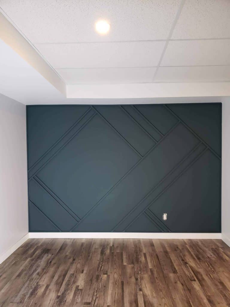
This feature wall takes on a modern twist with 45 degree angles and irregular pattern. Once again we will use Benjamin Moore’s Yorktowne green. It’s a very traditional color (part of BM’s historical palette), but seems to become sleek and sexy when mixed with a feature wall such as this.
We are going to keep the original mid-century light fixture, after giving it a thorough cleaning of course.
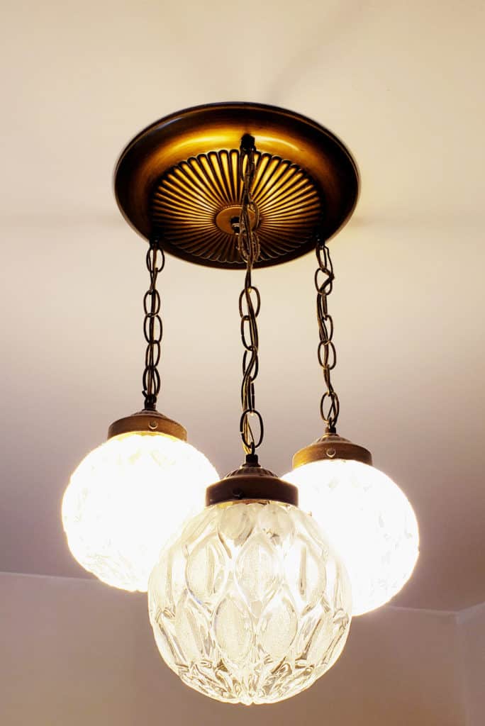
The gold/brass color will tie in with the rest of the house, and complement the green feature wall perfectly.
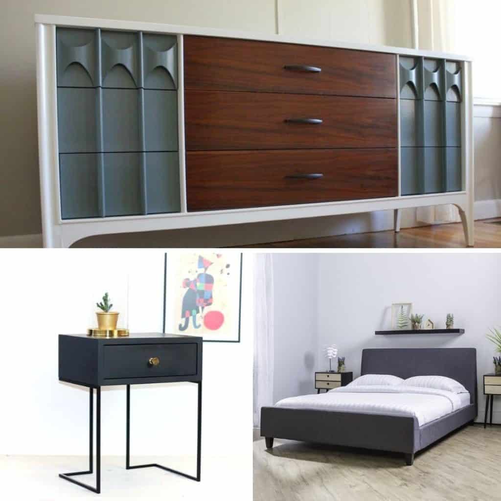
The rest of the master bedroom design will be brought together with staging materials. A few of the design ideas:
- A low profile fabric headboard/bed frame. I want to add some softness to the overall design, and fabric finishes are a great way to do this.
- Black metal nightstands. This ties back into the sleek modern aspects. Plus the black will blend with the other black elements (door knobs, light fixtures, etc) throughout the entire home.
- A long mid-century dresser. Potentially even refinished with some painted elements to funk up the look.
The Main bathroom
Much like many other houses built around this time, there is only one bathroom on the main floor. Therefore, we need to make one awesome bath- no fiberglass insert tub surrounds, no fake tile walls, no boring vanities! We need this bathroom to be a showstopper. However, the design for this space is the least nailed down. It seems to fluctuate daily…
Even still, we will stay true to our somewhat random design plan- the bathroom will feature a mix of modern and traditional touches.
Starting with the floor, the plan is to use a 12×24″ vinyl tile with a cement finish. This will be the modern/industrial base to the design.

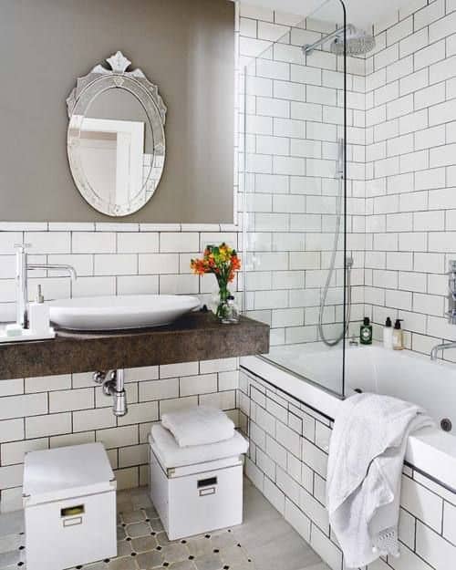
As of right now, I am leaning toward subway tile for the tub surround, as well as half way up the rest of the walls of the bathroom. Subway tiles are one of those items that seem to fit in with nearly every style. Wrapping the bathroom in tile will help give it that luxurious spa like feel. The photo below gives you a rough idea of what I have in mind for the subway tile. However, I will pair them with an almost black grout for the sharp contrast.
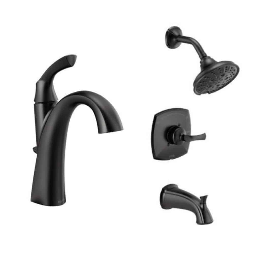
At this point, you may be thinking the bathroom design might feel cold and sterile. BUT, we will have the original mahogany door and the original wood medicine cabinet to warm up the space. Originally, I was planning to add another touch of wood tone in the vanity, but the more I think about it, the more I am leaning toward a solid black vanity. It is not something you see everyday, so hopefully it will standout. The black will also blend in with the black fixtures we have already purchased. We went slightly more traditional with the faucet design. To be honest, this was a budget conscious purchase. These Delta faucets are rated very highly, and were a steal of a deal on Black Friday.
The vanity lights definitely need an upgrade from the original white flowery glass. We chose lights with an industrial look finished in matte black and gold. They stay right on theme with the rest of the lighting in the house. You will have likely picked up on the trend. A house should flow from room to room with trends/finishes carried along. This is incredibly important when trying to make a house cohesive.
Finally, the last part of this main bathroom will be on the ceiling. I am seriously considering carrying over the Yorktowne green from the master bedroom feature wall and using it to paint the ceiling. This is more of a gut instinct and I have a sneaking suspicious it will be the perfect finishing touch to the room. Worst case scenario, we paint over it.
Stay tuned to the reveals to see if I go that route!
The living room
At our second house, Hilltop, we didn’t do anything special with the living room. I want to change that in The Partridge House.
Because we aren’t dealing with an open concept living area off the kitchen, this room needs to show real purpose to potential buyers.
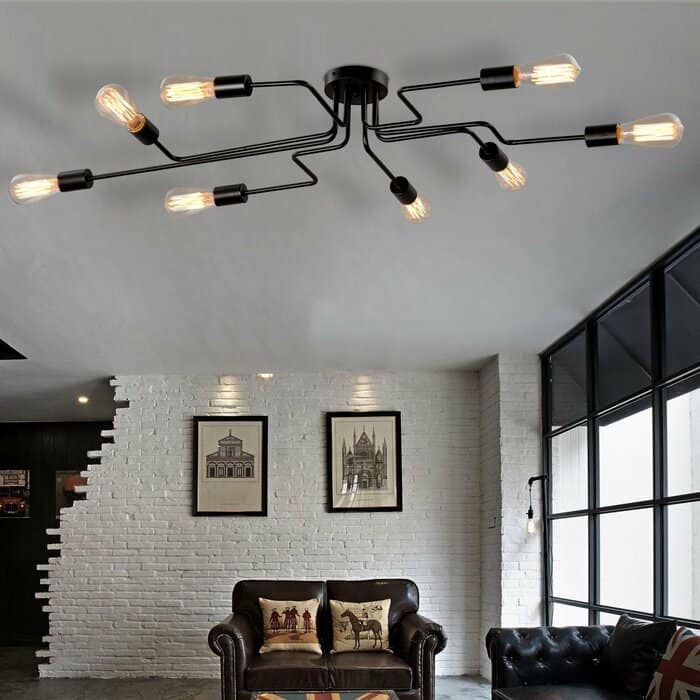
To start off the design, we are going to skip the pot lights and instead opt for a cool industrial light fixture. As functional as pot lights are, they are boring. This on the other hand, not so much.
We are also going to add a library area to the back wall. It will be another IKEA hack using BILLY bookcases, so stay tuned for that one! However, unlike the built-in BILLY at The Beige Bungalow, this one will include some open shelves and a bench seat for reading.
The Kitchen/Dining room
Finally, the heart of the home! And the room I love designing. If you remember in the house tour, the kitchen and dining room are joined at the back of the house. In it’s current setup, it feels far more like two separate rooms with the weird peninsula and overhead fan. In our design, it is going to feel like one large eat-in kitchen.
Naturally, we will be using IKEA cabinetry. Would you really expect anything else at this point?
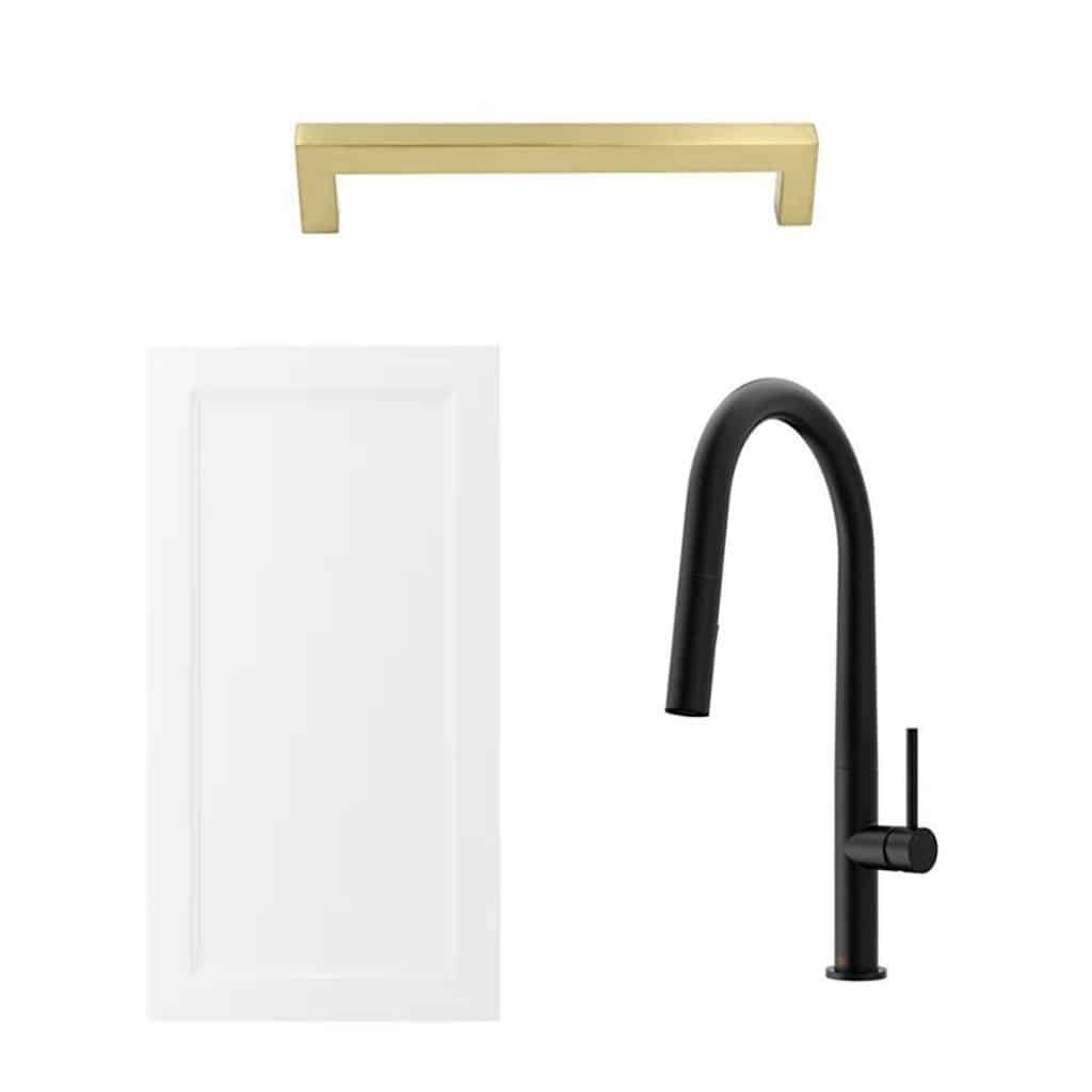
This time we will be using one of IKEA’s newer designs called AXSTAD. They are a bright white, shaker style door. Therefore, a traditional door design that works nicely with modern or industrial touches.
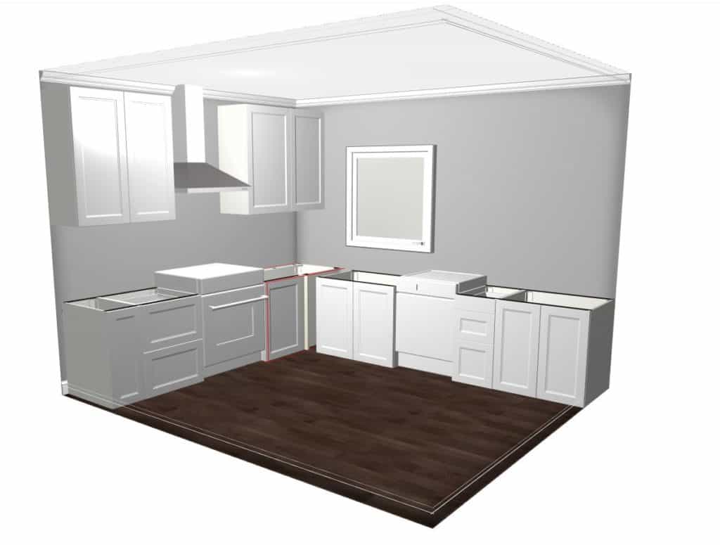
I am not going to get into the exact cabinet layout. Just know that I am very particular about what cabinet goes where. Each one serves a specific purpose, and placement should not be an afterthought. Read our reveal post from Hilltop for a detailed discussion about kitchen layout and cabinetry placement. Plus be sure to learn our secrets to getting the IKEA kitchen sale discounts nearly year round!
I want the quartz countertops to nearly blend in, so we will be using a largely white finish. Don’t worry we aren’t creating just another boring white kitchen! The real details are coming!
Now that the white base is set, it’s time to add some funk and flair to the space. The stainless steal range hood will add some industrial style to the design, and the matte black modern faucet made by VIGO will really pop against the white backdrop. Continuing along, we have already purchased modern gold hardware for the cabinet pulls. They are also a slightly larger size (6 1/2 inches), which adds to that modern look.
The last piece to this part of the kitchen puzzle is the backsplash. The goal: a geometric mosaic with some grey (pull from the flooring), white (the rest of the kitchen), and gold tones (pull from the hardware). Was it possible? Well I happened to be walking through Lowes and there it was!
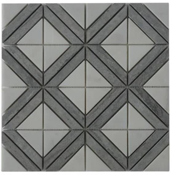
It’s perfect! Bonus, it’s made from natural stone as well. I seemed to forget all about the budget on this one; we definitely splurged a little to go this route.
Now on to the other half of the room- the dining area. You will notice there is no refrigerator in the kitchen layout above. That is because I wanted to increase the amount of working counter space around the range. Therefore, we are moving it into a custom built-in space along the back wall. This area will also include another 4 feet of counter space, this time out of bamboo, and have a secret walk in pantry area that I’m hoping surprises potential buyers. The whole area will be painted a bluish green color for an eye catching finish. The exact color- TBD.
If you are having trouble picturing this, good! I want to keep this part of the design somewhat of a surprise for the reveal, so you aren’t getting any more info than that.
Finally, the eating area will feature an L-shaped banquet. Perfect for large family dinners, or hanging out doing homework while Mom or Dad is cooking dinner.
And that’s a wrap. Join our community and follow along with this house, it’s sure to be a good one! If you are interested in working with us on a design for your home, head over to Homestud Studios to get started!
You may also enjoy:
No Comments